Lettering
Hi!
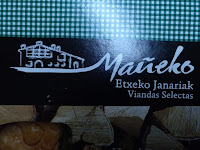
Lately, we´ve been talking about lettering in AV class. We learnt some different tips on this subjet and we realized that now a days, lettering is used in promoting brands. Every brand has its name written in its own way as we can contemplate here:
They all use different colors and caligraphies to send a message and in this way we also recognize the brand.
Here you have some different calligraphies I tried with the same meaning: WELCOME!
It was hard to do this artwork because Im not used to it, but I tried to do my best.
Hope you liked it ;)
Anyel❤
Lately, we´ve been talking about lettering in AV class. We learnt some different tips on this subjet and we realized that now a days, lettering is used in promoting brands. Every brand has its name written in its own way as we can contemplate here:
 |
| This one includes a drawing in the brand lettering. The draw is a big farmhouse whitch means that it is a home-made product. |
 |
| In this one, we can see a leaf in the top of the "I" as part of the lettering. The leaf is used like this because it´s a brand that sells vegetal milk. |
They all use different colors and caligraphies to send a message and in this way we also recognize the brand.
Here you have some different calligraphies I tried with the same meaning: WELCOME!
It was hard to do this artwork because Im not used to it, but I tried to do my best.
Hope you liked it ;)
Anyel❤


Comments
Post a Comment