Posts

Showing posts from October, 2018

Basic Photography

Image
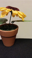
 Hi everyone!  Lately, we've been learning about basic photography and we've seen some tips in videos. Here we tried to use those tips. In some pictures we have taken the photo without the tip, and later correct it applying them. We can see a huge difference: In this photo, we have used the rule of third. First, we have put the object in middle and then, using the tip we moved to the left. In this one, we've focused on a part of the piano instead of in all of it. And it looks better. We've changed the background from a colorful distracting one, to a simple one as it gives importance to the object. In this case, we have used the rule of the odds. It looks better if there is an object in an odd quantity.
Lettering

Image
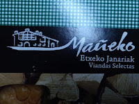
   Hi!      Lately, we´ve been talking about lettering in AV class. We learnt some different tips on this subjet and we realized that now a days, lettering is used in promoting brands. Every brand has its name written in its own way as we can contemplate here: This one includes a drawing in the brand lettering. The draw is a big farmhouse whitch means that it is a home-made product. In this one, we can see a leaf in the top of the "I" as part of the lettering. The leaf is used like this because it´s a brand that sells vegetal milk. This brand tried to use this lettering to impress the client. The gold color is associated to the glamour and that´s why it is used in this case. This wine means glamour, luxury, extravagance and riches.    They all use different colors and caligraphies to send a message and in this way we also recognize the brand.